MissedClicks.com

Why do people choose paymentsjournal.com?

A Click Power analysis

Discover what the searcher sees, thinks and expects before choosing.

Icon

I'm Gjaelt. And this is what I see:

I feel like I'm looking at a sterile business card rather than a helpful guide. A clear problem and a sense of what I'd lose by staying uninformed were totally missing, making the whole thing feel flat. The lack of a specific, urgent hook would still stop me from clicking.

3.8

2026-07-16 - PaymentsJournal is a free, comprehensive online payment news and information portal designed to keep payments and banking industry professionals informed.

Click Power diagnosis

paymentsjournal.com

Total click power
0.0
The calculated click power for this result on Google 3,8.
Recommendation: pay attention to your Schema Markup – visual information
Sector position
#6
Top 47% in Creative, media
of 13 scans
Average
3,5
Lead
+ 0.0
Your score
3,8
Scores per SEO element
This is what goes on in the mind of the seeker

the 5 key elements of a search result

Title - heading

I feel like I'm looking at a professional brochure that forgot to invite me inside. It tells me what it is, but it doesn't make me want to stay. I want to feel like the hero of my industry, but this just feels like homework.

Meta description - description

I felt like I was reading a textbook instead of finding a partner for my journey. It is clear and honest, but it doesn't make me feel excited or curious. I want to feel a connection that makes me choose this site over all the others immediately.

URL - web address

I feel like I found a solid, professional place to get my industry news. It builds a lot of trust because it looks so clean and very official to me. I just wish it felt a little more exciting so I would choose it first.

CTA – call to action

I feel a bit bored because the message lacks a heartbeat to pull me in. It tells me what it is but does not invite me to be part of the story. I will probably keep searching for something that speaks to my soul and my business needs.

Schema Markup – visual information

I felt like I was looking at a closed book with a very plain cover. The information is there, but it does not reach out to help or excite me. It needs a more human touch to win my trust and my time. But with one tweak...

This is what goes on in the mind of the seeker

Attention

The title "Payment News for Industry Professionals" tells me exactly who it is for, but it fails to generate real excitement. It acts as a static label for a service rather than a hook that addresses a current problem I am facing in the industry.

Visual signals

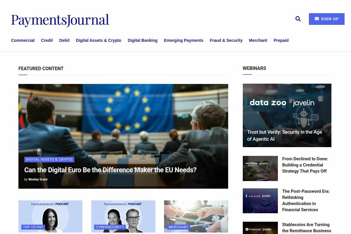
I notice a structured result that includes breadcrumb information and organization details. There is also a SearchAction mentioned in the markup which suggests I can find specific topics easily, though it lacks striking elements like review stars or prices.

Perception

The result feels professional and focused because of phrases like "banking industry professionals informed." It positions itself as a "comprehensive" source, which gives me a sense of its broad coverage and competence in a specialized niche.

Expectation

It is very clear that I will find a "payment news and information portal" after clicking. I expect to land on a homepage filled with articles and headlines curated specifically for people working in the "payments and banking" sectors.

Emotion

There is no concrete problem or urgency mentioned in the text, so I feel no emotional pull. Phrases like "designed to keep... informed" are purely functional and fail to trigger any significant curiosity or fear of being left behind.

Benefit

The primary benefit offered is being "informed" through a "free" resource, which is helpful for professional growth. While it promises a "comprehensive" experience, the benefit remains quite general and doesn't promise a specific solution to a business task.

Distinctive character

The snippet uses standard language like "expert insights" and "timely news" that many other portals also use. There is no unique feature or exclusive access mentioned that would make PaymentsJournal stand out from other news journals.

This is why the searcher does not select you:

Pay attention to your schema markup – visual information.

I felt like I was looking at a closed book with a very plain cover. The information is there, but it does not reach out to help or excite me. It needs a more human touch to win my trust and my time. But with one tweak...

The first steps from being seen to being selected

Include frequently asked questions now

Add an FAQ section to your markup to answer common industry payment questions immediately today. This helps your page take more space and shows you have the answers I need. People like me will see your expertise and feel much more confident in clicking now.

Add gold stars for social proof

Include a rating system in your data so I can see gold stars right away. These stars make me stop scrolling because they prove other professionals trust your news source. Seeing high ratings makes your site look much more reliable and professional than your competitors.

Use news article structured data today

Implement news article markup to highlight your latest headlines and important publication dates clearly today. This tells me your content is fresh and relevant for my daily business needs now. I will feel a sense of urgency to read the most recent industry updates immediately.

Highlight specific professional news benefits

Use more descriptive benefit tags to explain exactly how your information helps my business grow. Clear benefits act like a promise that my time spent reading will be very valuable. I want to know exactly what I will learn before I decide to click through.

Create a unique industry angle online

Mention specific special reports or exclusive interviews within your schema to look very different online. Showing unique content makes me feel like I am getting something others might be missing. This special feeling creates curiosity that drives me to explore your site much further today.

Call for immediate reader action now

Add a clear read action to your code to guide my next steps very simply. A clear path makes it easy for me to decide where to go and read. Giving me a small push helps complete my journey and solves my need for news.

Other companies in Creative, media

Check the Click-Power of your website

The better your search result, the more often customers will click on you!

Enter your website address and get your score instantly!
Ready in 10 seconds.